Proven Design Principles for Living Room Decorating
Even though cold weather lingers, I’m already dreaming about spring – specifically, spring decorating. Every seasonal transition brings that familiar urge to update our homes. The best part? While you’ll rotate seasonal colors and accessories throughout the year, the proven design principles that create beautiful, balanced rooms stay the same and work every single time.
Since living rooms and family rooms are where we spend most of our time relaxing, entertaining, and making memories, they’re often the first areas that benefit from a thoughtful refresh. The even better news? You don’t need a complete overhaul to make a significant impact.
With spring around the corner, I thought now is a great time to review those proven design principles that apply to every season. A little reminder of what makes a room – especially our living spaces – work so well will help us stay grounded, avoid design mistakes, and create the intentional environment we want to live in.

This post contains affiliate links to products used to create this project. If you should order any item from this site, I may receive compensation, but you do not pay a penny more. Your purchase is greatly appreciated as it helps support the continued publication of this site.
NOTE: Unless otherwise noted, all images in this post are from Bluesky at Home.
Small Changes, Big Impact
Arrangements you already have in place can be easily transformed with a few thoughtful additions or subtractions. This list of essential design practices applies across all decorating styles, color palettes, and seasons. Whether your aesthetic is modern, traditional, coastal, or transitional, these principles create rooms that feel polished and intentional.
Sometimes our design “memory” needs a little reminder, so let’s review the proven practices that professional designers rely on year after year.
Creating Visual Impact Through Grouping
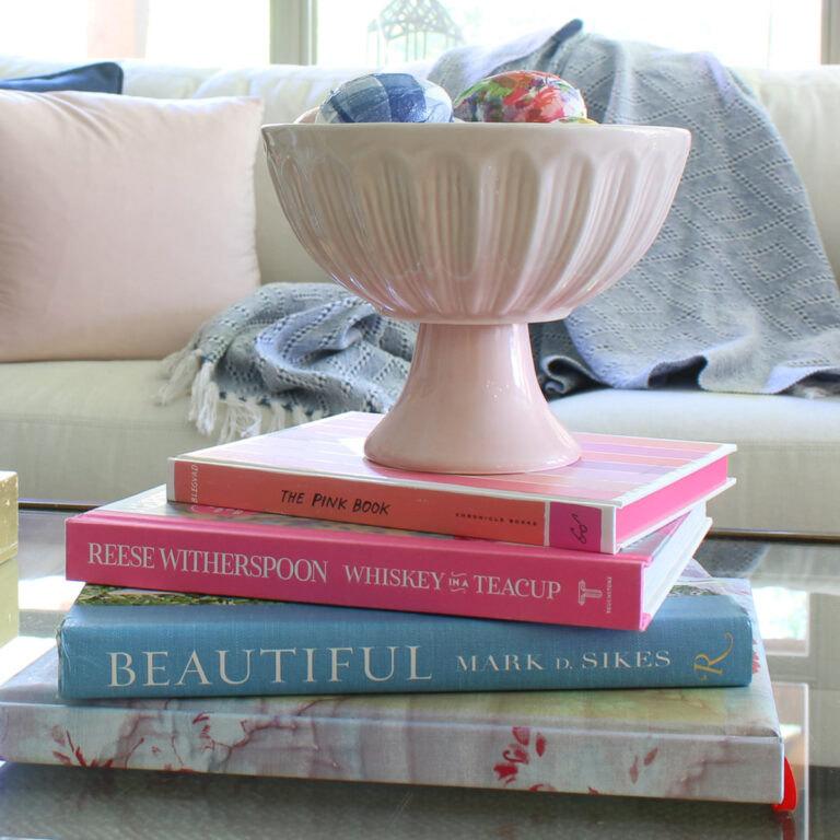
Group items for more impact. Single accessories scattered around a room often get lost visually. Instead, clustering items together creates focal points that draw the eye and add sophistication to your space.
For example, three candlesticks grouped on a console table make a stronger statement than those same candlesticks placed separately throughout the room.
If you have a collection of similar chinoiserie pieces, group them on your coffee table, mantel, or console.
Use baskets, boxes, platters, or trays to gather items. Corralling accessories on a tray or in a decorative container serves two purposes: it creates an important grouping effect while also defining the boundaries of your vignette.

A tray on an ottoman can hold remotes, coasters, or a small plant, transforming practical items into an intentional display.

Use odd numbers. This time-tested principle works because odd-numbered groupings (three, five, or seven items) feel more dynamic and natural than even numbers. Your eye moves more easily through an odd-numbered arrangement, creating visual interest without the symmetry that can feel too formal or staged.

The Power of Space and Height
Leave space around your accessories – think of negative space. One of the most common decorating mistakes is overcrowding surfaces. Negative space (the empty area around objects) is just as important as the objects themselves. It gives your eye a place to rest and allows each piece to shine. If your coffee table, shelves, or mantel feel cluttered, try removing 20-30% of what’s there.
What items would you remove from this small occasional table? There are a few options that would improve the design.

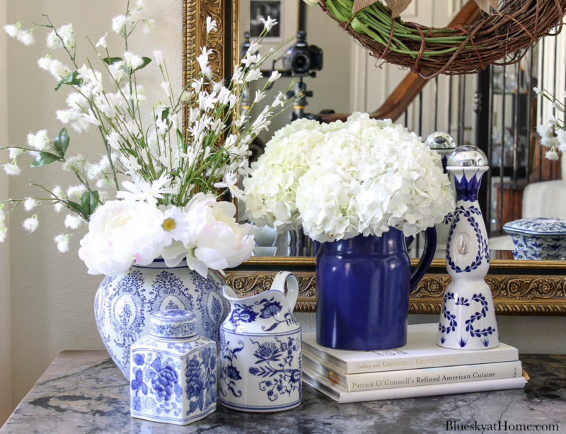
Vary the height of your elements. Flat, same-height arrangements lack dimension. Create visual interest by incorporating items of different heights – a tall vase next to a stack of books beside a small succulent, for example. This variance guides the eye up and down, making your vignette more engaging.
The different heights in this lovely vignette are a perfect example of this proven design principle. It also shows off why grouping items works so well.


Containers That Showcase
Use cloches, apothecary jars, or other large glass containers to hold items. Glass containers elevate ordinary objects into displayed treasures.
Place seasonal items, decorative balls, pine cones, or small plants under a cloche to add both height and a collected, curated feel to your space. These transparent vessels protect delicate items while keeping them visible.
Items as simple as rope or matches create interest since their shape and texture show through glass containers.


Texture, Materials, and Metallics
Vary the texture of items. A room filled with only smooth, glossy surfaces feels cold and incomplete. Mixing textures – smooth ceramic with rough woven baskets, soft velvet pillows with nubby linen throws – adds depth and warmth. Texture creates visual and tactile interest, making spaces feel more inviting.

A great way to bring natural materials into your home is by making them yourself. Create statement pieces for your home by adding twine to inexpensive glass jars.

Mix in natural textures: rattan, burlap, glass, metal, wood, jute, twine. Natural materials ground a room and prevent it from feeling too precious or untouchable. A wooden bowl, rattan basket, or jute-wrapped vase adds organic warmth that balances more refined pieces. These materials work across all decorating styles and bring the outdoors in.

Include metallics, such as brass, gold, silver, or copper, in accessories and hardware. Metallic accents catch light and add a layer of sophistication to any room.
You don’t need to commit to one metal – mixing brass candlesticks with silver frames and copper accents creates a collected-over-time look that feels authentic. Don’t forget hardware on lamps, picture frames, and furniture counts too.

Bringing Life Into Your Space
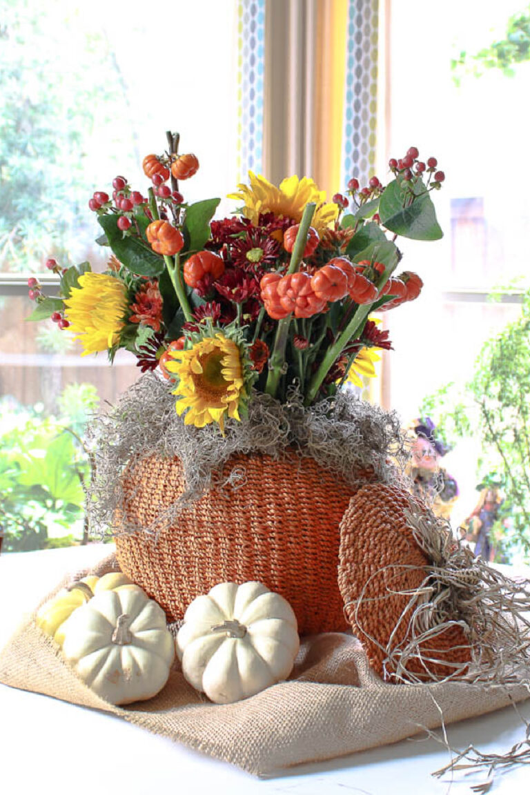
Combine fresh and faux flowers or greenery. Living plants and fresh flowers add life and energy to a room, but high-quality faux options have become remarkably realistic.
Use a combination: faux stems for permanent arrangements in hard-to-reach spots. Showcase fresh flowers for seasonal updates and fragrance. Both contribute to a room that feels alive and cared for.


Showcase fresh flowers for seasonal updates and fragrance. Both contribute to a room that feels alive and cared for.

Include art in your accessories. Art doesn’t only hang on walls. Small framed prints can lean against books on shelves, artwork can rest on mantels or console tables, and even decorative plates or vintage postcards count as art. Incorporating art into your accessory arrangements adds personality and a gallery-like quality to everyday surfaces.


A single large piece of art can be a dramatic focal point.

Color, Scent, and Comfort
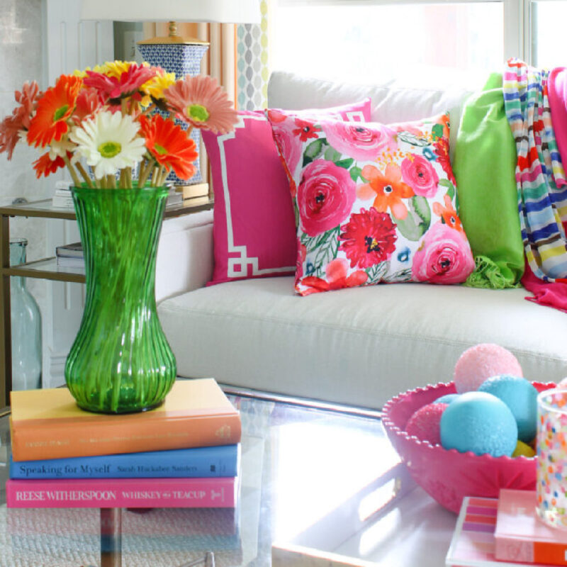
Use a combination of colors for interest. While you may have a cohesive color palette, using variations within that palette prevents monotony.
If your room is primarily neutral, add pops of color through accessories. If you love blue, which I do, incorporate several shades from navy to powder blue for depth.

Add candles with seasonal color and scent. Candles provide both visual appeal and sensory experience. The flicker of candlelight adds warmth and ambiance, while seasonal scents can subtly transform the mood of your space. Arrange candles in groups of varying heights, and don’t be afraid to light them – they’re meant to be enjoyed.

Use throws and pillows for color, pattern, and texture. These are the easiest and most affordable ways to refresh your living room.

Switching out pillow covers or adding a cozy throw instantly updates your color palette, introduces new patterns, and provides the comfort that makes a living room truly livable.
Foundational Design Principles
Remember that paint is a designer’s magic wand. When in doubt, paint transforms. Whether it’s refreshing wall color, painting an outdated piece of furniture, or adding an accent wall, paint offers the biggest impact for the smallest investment. It’s the foundation upon which all other design decisions rest.
You can use paint sparingly or color-drench a room.


Most Important of the Proven Design Principles
I don’t know if there are two more important and proven design principles than scale and balance.
Scale is important to a pleasing sense of “all is right” in design. Oversized furniture in a small room feels overwhelming; tiny accessories on a large coffee table look lost.
Pay attention to the relationship between objects and the spaces they occupy. A large sectional needs substantial artwork above it, while delicate chairs pair well with smaller-scale tables. The scale of a coffee table should complement the size of the surrounding furniture.

Balance, whether symmetrical or asymmetrical, creates a comfortable and restful environment. Symmetrical balance (matching lamps on either side of a sofa) feels formal and traditional. Asymmetrical balance (a tall plant on one side, a stack of books and a sculpture on the other) feels more casual and collected. Both approaches work – choose what fits your style, but some form of balance is essential for a room that feels complete.
Can you immediately see the difference in the symmetrical arrangement and the asymmetrical arrangement?


NOTE: Even asymmetrical arrangements can be balanced by creating equal visual weight.
Don’t forget there are reasons professional designers repeat these same design practices year after year: they work. These proven design principles have stood the test of time because they create rooms that feel intentional, beautiful, and comfortable – regardless of your budget, style, or season.
As you prepare your home for spring and the warmer months ahead, use these guidelines to refresh your living room. You’ll be amazed at how small, thoughtful changes based on solid design principles can completely transform how your space looks and feels.
Download your free printable design checklist to keep these tips handy as you style your living room this season and beyond.

Here are some other related posts that will help you as we move toward spring decorating: 10 Essential Interior Design Elements, Fresh and Colorful Spring Home Tour, and How to Use Color to Decorate Your Spring Home.
I hope these proven design principles have reminded you of the importance of following tried-and-true design practices, especially in your living room. For more inspiration, check out these Pinterest boards: Home Decor and Spring Decor, for research.