Valuable Guide to Choose the Right Paint Color for Your Home
Have you ever found yourself overwhelmed by the challenge of choose the right paint color for a room in your home? Here is a valuable guide to choose the right paint color for your home.
As impactful as changing a paint color can have in our rooms, making the decision about the color and type of paint can drive us crazy.
Many homeowners find themselves standing in front of a wall of paint swatches, feeling overwhelmed and uncertain. The sheer number of colors, finishes, and brands can turn what should be an exciting home improvement project into a daunting task.
It’s common for people to second-guess their choices or worry about making a costly mistake that they’ll have to live with for years to come.
This apprehension can lead to playing it safe with neutral tones, potentially missing out on the transformative power of color in their living spaces. Frustration can lead to inaction.
Don’t let the fear of paint keep you from the benefits of a fresh paint change. Use this valuable guide to choose the right paint color and type for your home.

Follow this Valuable Guide for Choosing the Right Paint Color
Financial concerns aside, there are legitimate concerns about choosing and using paint.
- Fear of commitment is a common hurdle. Some people worry that they’ll grow tired of a bold color choice or that it won’t match their furniture and decor.
- Additionally, concerns about the painting process itself – from proper preparation to achieving a professional-looking finish – can make even enthusiastic DIYers hesitate to pick up a brush.
- One of the biggest challenges people face when choosing paint is visualizing how a color will look in their space. What appears perfect on a tiny swatch can sometimes feel overwhelming when applied to an entire room.
- Lighting plays a crucial role in how paint colors appear. Many homeowners struggle to know how natural and artificial light will affect their chosen hue throughout the day.
Paint is the least expensive way to dramatically change the look of a room. It’s important to remember that paint is one of the most versatile and forgiving elements in home decor.
With a little guidance and the right approach, anyone can overcome their paint-related fears and create a space that truly reflects their personality and style.
After all, if a color doesn’t work out as planned, it’s relatively easy and inexpensive to start over – a reassuring thought for those taking their first steps into the colorful world of home painting.
Design Event Inspiration
Last weekend, I had the pleasure of attending a “Design Event” at my local Ballard Design store. The event was titled “Decorating with the Color of the Year”, presented by their local Design Team. Content was based on insights from Corey Damen Jenkins‘s new book, Design Reimagined, It has a beautiful cover.

The book isn’t available until September, but you can order it now. There was a drawing for a copy of the book, but I didn’t win.
Two in-store designers based their presentation on the Benjamin Moore color of the year, Cinnamon Slate, a color described as “a delicate mix of heathered plum and velvety brown, this nuanced color brings a smooth familiarity to any design.”

To be honest, I wasn’t ga-ga over this color when I first saw it a few months ago online. Plums and browns are not in my favorite color palette.
Each of the designers used Cinnamon Slate as the inspiration for designing a room.
I was really impressed with how each designer brought in other patterns, colors, and textures that worked beautifully with Cinnamon Slate.
One designer mixed blues with Cinnamon Slate in a bedroom mock-up. The other used shades of blush and mocha in an office.
They explained their design choices for paint, fabric, wallpaper, and accessories. I took
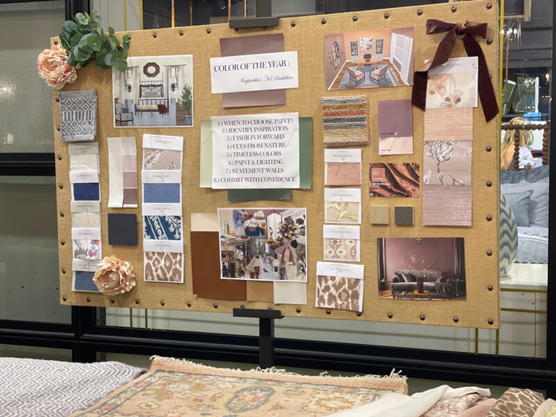
The main focus of the talk was the process of choosing paint and how to use it in our homes. I took lots of notes and collected design ideas.
The presentation was interesting and informative. Afterward, there was time for questions. Then I walked around the store and took pictures of the new spring collections, which were beautiful.

Now I want to share the paint ideas with you.
How to Choose a Paint Color
Here are the basic guidelines (hesitate to call them “rules”) the designers shared.
“Wait to Paint”
That may sound counter intuitive to this discussion, but when redoing a room, choosing a paint color is not your first step.
Since there are thousands of paint colors and every paint color can be adjusted, it is easier to choose a paint color that compliments your major items than try to match a color to your wall color.
Identify Your Inspiration
What can you find inspiration for a paint color? It depends on the room, but here is an overview:
- a rug
- art
- nature
- fabric
- wallpaper
- upholstery
- decorative accessories
- dishes
- linens
- heirlooms
Once you’ve identified your inspiration items (yes, you can have more than one), take a look in your closet.
The clothes in your closest tend to be more fashion forward than the upholstery on your sofa. Do you dress in black and white, soft pastels, bold colors, or neutrals?
The colors you wear are usually the colors you feel most comfortable with. We are happiest surrounding ourselves with colors we love.
It’s All About the Finish
Paint just doesn’t come in different colors. It also comes in different finishes and that is a very important consideration.
What is a paint finish? It refers to the level of glossiness or reflectivity of a painted surface. This ranges from flat (matte) to high gloss, with various options in between.
Here are the types of finishes and their descriptions:
- matte – the least reflective of all the finishes. This type of paint almost has a chalky texture when dry. It’s the least durable and is this type of paint is best used in low-traffic areas, such as living rooms, dining rooms, bedrooms, and ceilings. Imperfections are less noticeable, important if you live in an older home.
- semi-gloss – is easier to clean, but it does show more imperfections, so good prep work is important. it works well in bathrooms and kitchens. It’s also great for trim, cabinets, woodwork, and doors. The reflective surface of semigloss paint helps darker rooms feel lighter and brighter without catching the eye as much as high gloss does.
- high gloss – creates a reflective surface and makes colors look much more vibrant. It is good to use on doors, trim, furniture, or accent pieces. It creates more of a bold, dramatic statement, but it’s also quite durable for these areas that are prone to wear and tear. Dining rooms, libraries, and formal spaces lean into high gloss.
- eggshell – durable and great looking, eggshell is the most common paint finish used throughout homes. It provides a low sheen and a smooth finish that can subtly enhance color depth. Eggshell finishes are more washable than matte and resist stains and scuffing (great for homes with kids too). Great in kitchens, laundry areas, butler pantries and high-traffic bathrooms and hallways.
One more thing: water-based or oil-based paints?
- water-based – dry faster, are easier to clean up with water and had a milder odor. Use water-based formulas for areas like walls, ceilings, and doors.
- oil-based – offer a hard, more durable finish, and can withstand routine contact. but require specialized thinners for cleanup. They usually have a strong ordor during the paint process. They are ideal for cabinetry, moldings and trims.
Purpose of Your Room
Do you want your wall color to be crisp and clear or moody? Light or dark? Part of that answer has to do with the room’s function and the mood you want to create.
Paint isn’t just about color. It’s also about the purpose of the living space.
Here are some considerations:
In work spaces, such as the kitchen, office or laundry room, light and crisp is probably better since that evokes energy and activity.

source: Michael Partenio in Better Homes & Gardens
A bedroom tends to be softer with grey undertones, evoking a restful setting. But it can be dramatic in this blue on the walls and trim.

source: Photo by Laurey W. Glenn; Styling: Buffy Hargett Miller in Southern Living
This bedroom is color-drenched in blue.

source: Bjorn Wallender in Veranda
For the dining room, which we don’t spend a lot of time in, consider your wall décor, such as wood tones, mirrors and lighting. Whether you go for drama with a bold, dark hue, or keep things light with an off-white paint color or a neutral, no color is off-limits for dining rooms. It’s probably best to keep a consistent color flow from the dining area to the main living spaces of your home.

source: Clare.com

source: Architectural Digest
Living spaces, where the most activity of the home takes place, is where you establish your signature style. When it comes to living room colors, you first decide on the atmosphere you want to create. Relaxed and casual? Formal and elegant? Modern and polished? Cozy and warm? Once you have set the mood, the perfect living room paint color will underscore it.
Without changing a single think in a living space (furniture, art, rugs, accessories), you can dramatically change the feel and mood of a room with paint.
In the photo below, Sea Salt is used. We have this color in our living room and master bedroom. I love this soft color and changes color with the light.

source: Allison Garrison in Good Housekeeping
Consider the Light
Probably the most important consideration is lighting. How much natural light do you have in a room? The amount of light your room gets and the direction it faces will have a direct impact on how a color appears.
For a room with southern or western exposure, lean towards cooler hues for balance with strong natural sunlight. Conversely, rooms with northern or eastern exposure should lean toward warmer hues.
The Long and the Short
The last consideration before you start to chose colors is your situational preferences.
- Do you want a traditional color that will last the test of time? Something that will not go out of style in the next five years? Are your choosing paint color for a dining room whose furniture and accessories will be there for the next twenty years? Or is this color for a child’s bedroom that may change in five years?
- Are you comfortable with a trendy color? Something that you don’t mind repainting in three years? Is this a room whose purpose may change? From a bedroom to an office?
Think of it this way: there are traditional blues that will never go out of style, but there are some that may only be popular for a few years.
Now you are ready to choose paint colors.
Determining The Right Color for Your Space
Now the fun begins, but it can also be the challenging part. Be patient and don’t rush the process. Keep following this valuable guide to choose the right paint color for your home.
Once you’ve determined the general color you want for a room, it’s time to visit the paint store of your choice. Use the paint swatches provided. Pick several that are close to your vision for your room.
You’ll notice that the colors on a paint strip are variations of the same formula. They share the same undertones but have different intensities. The very bottom color will give you the best idea of the undertone and color family.
Take several paint strips home. NEVER choose a paint color in a paint store.
Look at them in the room you want to paint at all times of day, from bright morning light to golden afternoon light to lamp-lit darkness. Hold them against existing inspiration colors – upholstery fabrics, wall art, lampshades, and curtains. Narrow your choices to two or three colors.

Many paint companies provide large paint swatches – about 12 X 12 inches – that you can purchase. If not, buy poster board and cut it into 4 pieces. Buy the smallest amount of the paint colors that you like and paint each board with a different color.
A company called Samplize allows you to buy paint boards from a variety of paint companies that guarantee 100% color accuracy.
Believe me, this will save you time and money in the long run.
Hang the boards on the walls of your room for several days. Look at the colors in the morning, mid-day, and at night with your lighting turned on.
Can you narrow down the paint choices? Now paint the sample paint directly on the wall – at least a 12 X 12-inch square or larger. Go through the same process of looking at the colors at all times of days over a few days to see the color in bright sunlight and cloudy days.

source: Family HandyMan
Also, hold up a pillow, your artwork, whatever your inspiration is to the paint swatch. You are not trying to match the color, but to complement it.
Going through all this valuable guide to choose the right paint color for your home will help ensure that you find the right paint color for your home spaces. The process needs to be deliberate and intentional. It will help you find a paint color you love.
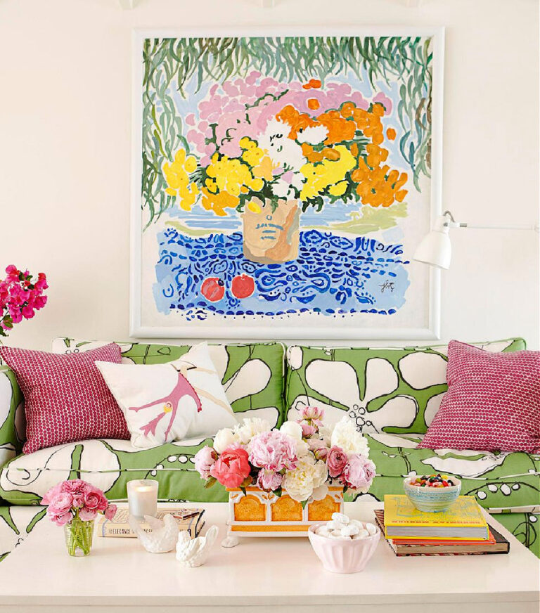
Here are some ideas involving color: 9 Tips for Choosing the Best Paint Color, 13 Inspiring Spring Home Decor Ideas, How to Add Vibrant Color to Your Home.
For more hands-on paint color help, get this FREE PRINTABLE: 9 Tips for Choosing the Best Paint Color

I hope that you will PIN this post to reuse when you need a valuable guide to choose the right paint color for your home. This Pinterest Board will give you more ideas: Beautiful Blue Design and Paint Colors.